← All posts
Web
Tempo has a new Reports page, right after Workouts in the sidebar. It adds up a period of training and shows it on one page, so you can see what a month, a block or a whole season came to without opening a single ride.
Pick the period at the top: Last week, This month, Last month, Year to date or Custom. Next to it, choose the activity type (it opens on Cycling if you ride, or All activities) and whether to count All locations, outdoor rides only or indoor rides only. Every number on the page follows those choices.
The first eight tiles are the totals: Activities, Active days, Duration, Distance, Climbing, Load, Work and Calories. Duration, Distance and Load also show the weekly average, so a month and a season read on the same scale.
Turn on Compare and every tile adds how it changed against the period before. Last week is compared with the week before it, Last month with the month before, This month with the same days of last month, Year to date with the same dates last year, and a custom range with the same number of days just before it.
Weekly breakdown draws one bar per week, with a dashed line at the weekly average. It opens on Hours, Load and Heat Load, and the menu in its corner adds Distance, Climbing, Work or Calories. Tempo remembers your choice in that browser. A week cut off by the start or end of the period is drawn lighter, so a short week does not look like a rest week.
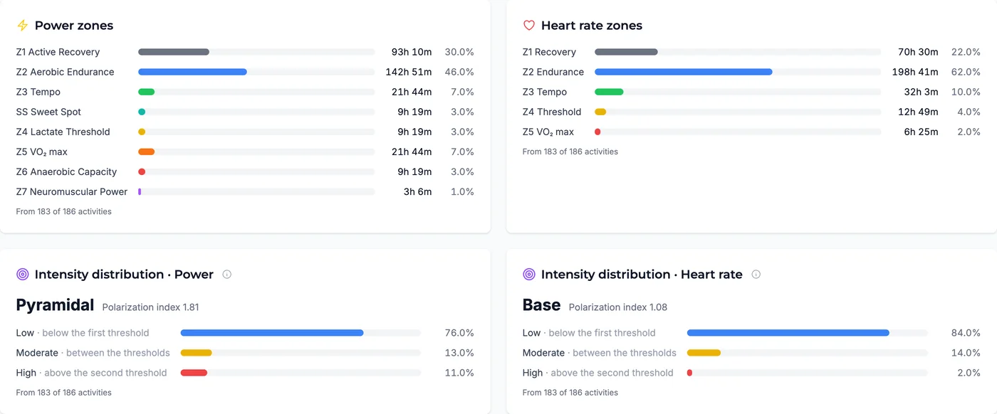
Power zones and Heart rate zones show the time you spent in each zone over the period, with hours and a percentage for each, and how many activities had zone data. Power zones use the FTP you had on the day of each ride, so a season that spans an FTP change still adds up correctly.
Intensity distribution groups that time into Low, Moderate and High, once for power and once for heart rate, and names the shape: Polarized, Pyramidal, Base, Threshold, High intensity or Mixed. It also shows the polarization index from Treff et al. (2019). A label needs at least three activities with zone data.
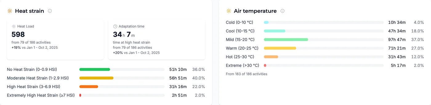
If the period has heat data, two more cards appear. Heat strain totals your Heat Load and Adaptation time (time at a Heat Strain Index of 3.0 and above, where heat adaptation happens) and shows time in each heat strain zone. Both need a CORE sensor. Air temperature shows the temperatures your head unit recorded, which describe the conditions, not your strain.
Single rides tell you how a day went. Most training questions are about weeks and months. Did that build actually add volume? Was this summer bigger than last? How much of your riding is really easy, and how much drifts into the middle? Until now the answers meant adding up rides by hand or guessing from the Fitness chart.
Reports answers them directly. The weekly bars show whether your recovery weeks happened. Compare shows whether this season is ahead of last. The intensity distribution shows whether your easy days stayed easy. All of it is computed on the server from the same workouts you already have, so there is nothing to set up.
Open Reports in the sidebar on the web. It opens on Year to date. Pick another period or activity type, or turn on Compare to see the change against the previous period.
Note: Reports is free for everyone. The Intensity distribution card requires a Premium subscription. Without one you see the card with a sample, not your own numbers.
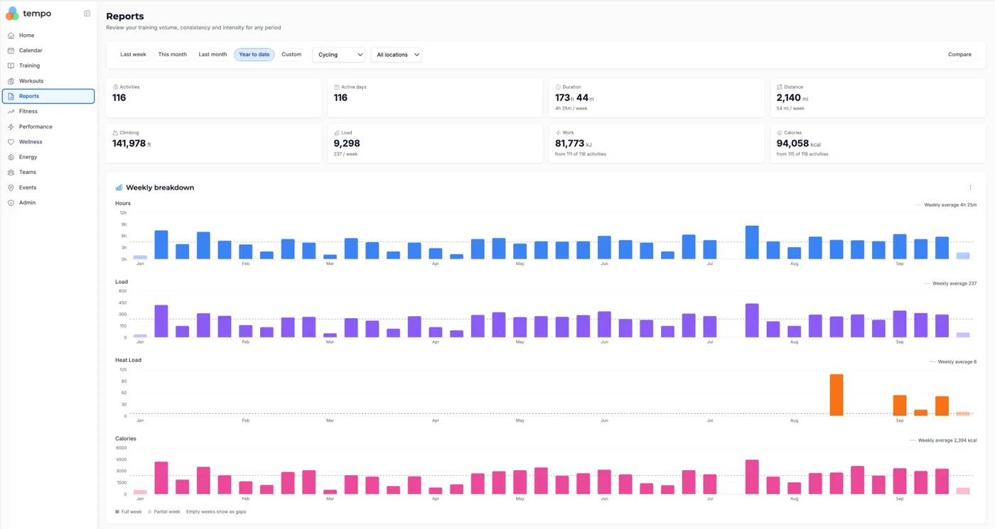
A cycling season from 1 January to 2 October: 116 rides on 116 days, 173 hours 44 minutes, 2,140 mi and 141,978 ft of climbing, at an average of 4 h 25 m and a Load of 237 a week. The weekly charts are set to Hours, Load, Heat Load and Calories. Heat Load has bars only for the weeks with CORE data, from August on.
Further down the page, here for a sample season, the zone cards show where the time went: mostly Z1 and Z2 on power, labeled Pyramidal, and mostly Z2 on heart rate, labeled Base. The heat cards follow when the period has heat data.